Sign Language
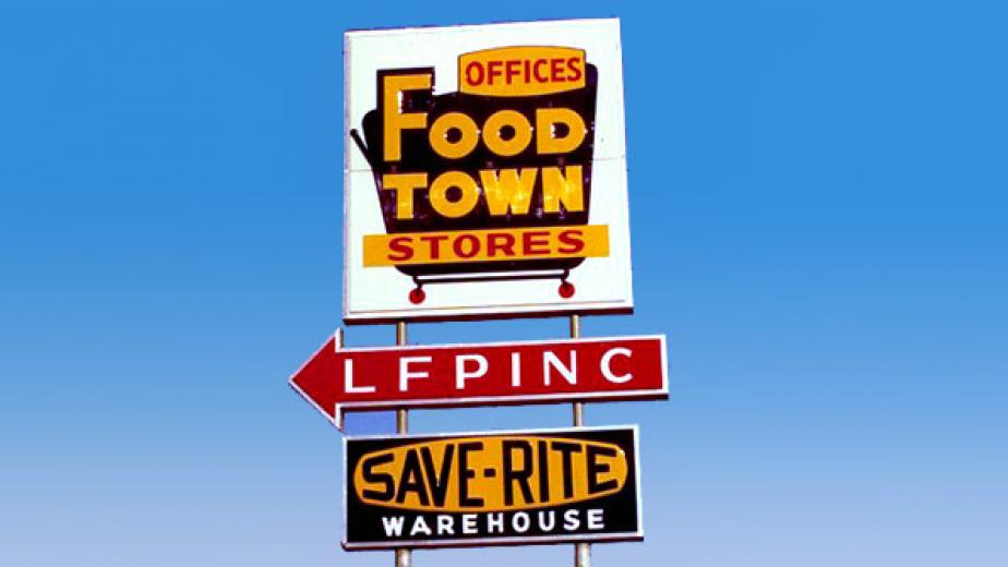
A Food Town pylon sign, likely from the late 1960s, includes the “LFPINC” acronym, which stood for “Lowest Food Prices in North Carolina,” the EDLP concept pioneered by the chain. Save-Rite referred to its buying operation.
Old Town
A Food Town store, pictured around 1959. The chain had just been founded by Ralph Ketner and two partners.
Enter ‘Le Lion’
When Delhaize “Le Lion” first bought into Food Town in 1974, the latter adopted the Belgian retailer’s iconic lion logo.
Name Change
With expansion complicated by frequent encounters with other retailers using the “Food Town” name, the chain officially changed its name to Food Lion around 1982. The cost-conscious company liked the change in part because storefronts required only two new letters. This store is pictured around 1984.
Leaner and Meaner
A Food Lion store in 1995, showing off a new, narrower font on the wordmark.
Back in Black
Food Lion’s newly opened concept store in Concord, N.C. is the first to fly its new logo. The lion is recast in black and no longer contained in a box.
Logo evolution
Food Town logo, likely from the mid-1970s reflecting stores in three states.
Red All Over
Food Lion officials say they rarely used this red-and-yellow logo. The lion in this iteration appears considerably larger than in other variations.
Leaner and meaner
The chain used yellow in its color scheme dating back to its earliest stores. The lion here is longer and leaner than the “red” cat.
Some perspective
Pictured here is Food Lion’s current logo, which has begun to be phased out. The secondary color is gone, and the lion is slim, inside a box.
In with the New
The lion has escaped its cage, and is rendered in black, while the wordmark takes on a deeper shade of blue — specifically PMS 647, sometimes referred to as “steel blue” or “blueberry.”